Context
Curve is a FinTech startup tackling financial issues that the public face such as but not limited to “Making the right choices on which accounts to use, how much you can spend, when to spend it, how to save it…” They are on the mission to solve this - by simplifying your financial life by connecting your credit accounts to one smart card and mobile app.
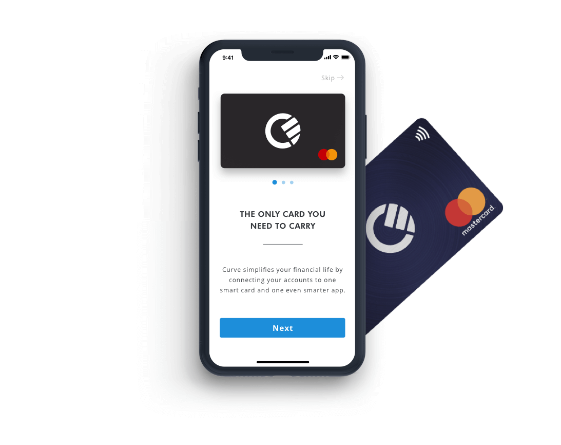
Being an avid user of their product and using their IOS app on a daily basis I felt the onboarding and overall visual style of the app could be improved and made to be more in line with their current website. The app is dark in contrast and uses dark navy tones whilst the website is very clean with a lot of white space.
The challenge
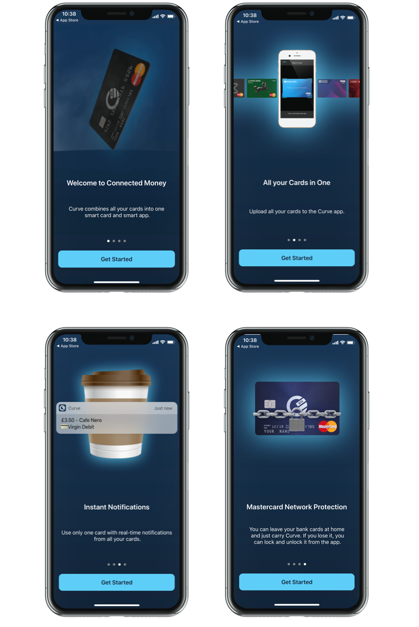
Below are the current designs for the Curve onboarding process. The challenge I set myself was to simply reimagine and redesign this.
I had thought about what I wanted to accomplish by doing this exercise and I came up with these 3 key objectives:
Solution
I approached this project using the 3 objectives to drive my design process, to be able to limit the scrolls I needed to know what content I was going to put in each screen and how many screens I could reduce for the onboarding process down to. I scanned their website taking key statements which describe what curve is all about and tried to categorise them into different buckets. In parallel to this, I was researching other companies and how they leverage and position themselves using the onboarding process. It became apparent that the onboarding process is less so about the company and more so the user.
I went through the statements I took from their website and thought about what kind of information as a user I would like to know and emphasise on during the onboarding process. I whittled it down to 3 main subjects per screen.
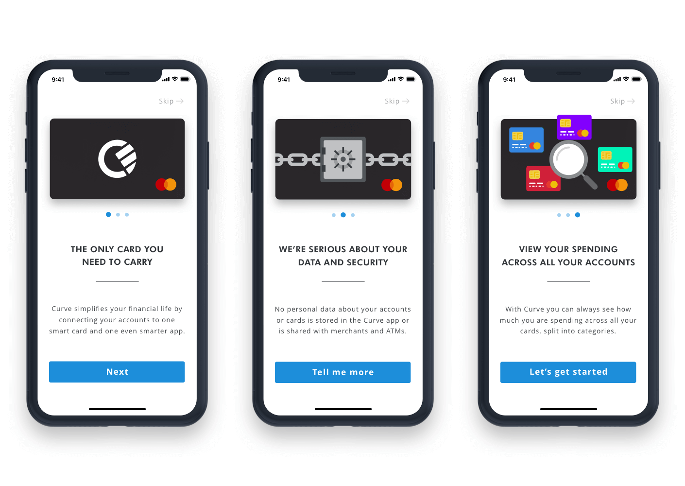
With my 3 subjects covered I then moved onto sketching out screen designs and how I envisioned it unfolding before the user's eyes. Whether it was swiping or tapping a button to progress each screen and how to use animation and interaction design to enhance the process a lot more. I had a basic layout sorted and I began working on icon designs for the individual pages that would represent Curve, Security and the additional feature.
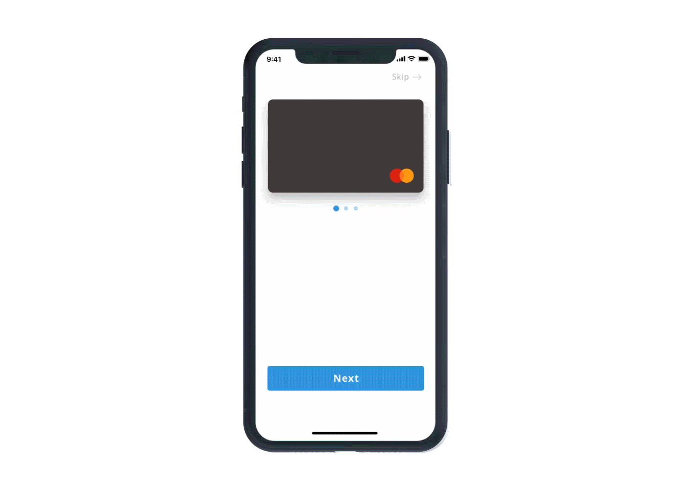
I really wanted to focus on the curve card itself because aside from the mobile app this is what the user will be physically using. By incorporating the Curve card graphic during the onboarding, I hope to familiarise the users to the concept and notion that by using this card you have the power to: Store all your credit and debit cards into a single Mastercard, be protected and know that your data is safe and lastly know that you have the ability to view your spending on all your cards.
Once I had designed the static screens and was happy with what I had done, I wanted to take it a step further and finish this project with some animation/interaction. I exported the necessary elements into Adobe After Effects and started to animate the screens and bridging them together to form the onboarding story that I had envisioned it being.
Below is the culmination of that work and I am really happy with how it turned out